Term 6 FMP – Social Media Critical Theory in support of my FMP ‘Trophies’ Public Outcome Choices.

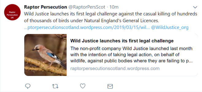
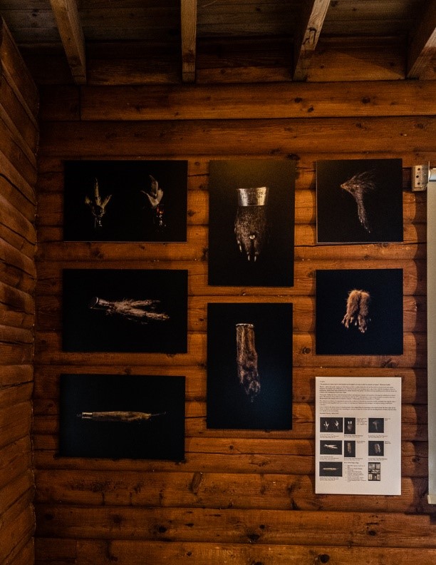
The message behind my FMP Trophies is about Conservation and where it is / how it is disseminated affects the effectiveness of the message – I wrote Final Major Project -Term 6: A place and a function for contemporary photography – deciding. about a survey to help with dissemination decisions so that I could talk to the unaware as well as the converted.

But the start of this was to try and get a basic understanding of the theory behind it. Those who know me well, know it is not my favourite place to be – mostly because of privacy but also because I abhor the control / influence it’s controllers have on certain sectors of society. In the interests of furthering my understanding ( so at least I can say I don’t like it having tried it all  – much the same as I have tried  marmite,  baked beans and gin and don’t like those either) I got stuck into the books and papers.

What is Social Media? The Cambridge English Dictionary defines it as:

Websites and computer programs that allow people to communicate and share information on the internet using a computer or mobile phone

But Fuchs (2014.p38) suggests that

all media and all software are social in the sense that they are products of social processes

So pulling this statement apart it is not to much of a stretch to consider cave paintings, town criers, newspapers, – in fact anything that shares information as media and the precursor to today’s internet based platforms.

Social Media – as we know it today – was the solution to the bursting of the Dot Com Bubble in 2000.  Investors needed new features to tantalise them. The promises and potentials of Web 2.0 offered a revitalising and expansion of the Internet economy.

Web 2.0 offered speed and ease of social collaboration, communication and co-operation, which could be harnessed to make money. Tangentially it was low cost since the social collaboration was unpaid – you find a product – you like – you tell your friends about it.

I read a lot about Participatory Culture Theory but distilled it down to two small but important sound bites:

  • Cultural diversity can be shared and advanced.
  • Not all voices are equal; resources for being heard are controlled by a few. An economic power.

This confirmed a statement made by Fuchs (2014. P56) suggesting that

Corporate platforms owned by Facebook, Google and other large companies strongly mediate the cultural expressions of Internet users.

My next piece of research took me down a narrower set of parameters – Conservation and Social Media.

Research by DiMinin E. Tenkanen, H Toivonen, T ( 2015 /3) carried out with self-selected candidates in Germany and Finland showed Facebook as the most popular platform for nature based posts,   Instagram and Flickr were jointly the least popular. They also discovered that:

Instagram and Twitter, are widely used for real-time posting of individual pictures and text.

Instagram is mainly used to share self-generated content, while Twitter is also being used to pass on content and links provided by others. I

 Facebook is often used to share individual pictures, or photo albums (e.g., from a trip) but not (necessarily) in real time.

Facebook was rated by this group as the most popular social media platform for their nature related posts

I found this information fascinating but it does not override the premise that resources are controlled by the few – who set the parameters for AI. I am happy that my survey and background research suggest that an editorial version of Trophies in a neutral publication is complimentary to the other methodologies and  will  disperse my message a little bit further than if I were to  just leave  it on the Web after the Installation at WWWT Washington  is taken down.

Bibliography

Social Media Definition.  Available at

DiMinin, E. Tenkanen, H Toivonen, T. 2015   ‘Prospects and challenges for social media data in conservation science’ available at https://www.frontiersin.org/articles/10.3389/fenvs.2015.00063/full [Accessed 02/01/2019]

https://dictionary.cambridge.org/dictionary/english/social-media. [accessed 01/03/2019]

Fuchs, C. Social Media – A Critical Introduction.  Sage. London

Using social media to strengthen public awareness of wildlife conservation.  Wua,Y. Xiea, L.  et al. 2018 . Ocean and Coastal Management Journal .2018. Page 78


Term 6: A place and a function for contemporary photography –Survey Results

At the beginning of the year I wroteFinal Major Project -Term 6: A place and a function for contemporary photography – deciding. about the right outlet for my work and ensuring it was shown in a place that would help to disseminate the conservation allegory in each image

In her Paper ‘The Museum as a University: Looking Out – Looking In’ (2006), Acord discussed how Curators including Obrist and Hoffmann look at sociological debates in their search for meaning in contemporary art. Themed social debates are usually found in relevant and appropriate sources / outlets.  These pockets, by their subject matter, are nuanced toward the converted; a factor already identified by wildlife / conservation professionals. Research into the effectiveness of conservation SM posts has shown that

 ‘Public knowledge and understanding are related to their attitudes and behaviour towards biological conservation’ ( Straube, 2013; Trombulak et al.2004 as cited in Wua et al ) 

However  algorithms are  also applied to SM  user accounts to interrogate, establish and then define  the posts likely to be of interest – If you dont express an interest in a subject – you wont see any posts about it . (Research by DiMinin E. Tenkanen, H Toivonen, T ( 2015 /3) carried out with self-selected candidates in Germany and Finland showed Facebook as the most popular platform for nature based posts, Instagram and Flickr were jointly the least popular.)

twitter image

Twitter Post

Whilst SM forms a component part of most marketing plans, the challenge for concerned participants is finding a broader audience whilst overcoming commercial necessity and AI governed dissemination

To support my choice of public outcome I designed a quantitative survey to assess the sources of my peer’s exposure to conservation messages, and to explore whether the source made a difference.   86.5 % of Respondents said that the quantity / frequency of information about the environment and or wildlife conservation in the nonspecific information sources they were exposed to (e.g. Periodicals, Social Media, and Events) was low. (Although 88.5 % of the respondents confirmed that they were, interested in this subject it is possible – with reference to SM, that their interest is not clear to the site algorithms, leaving them less exposed to subject posts. Further research would be required to come to a proven conclusion)

The survey results did confirm that there was potential for an increase in the dissemination and recognition of my message, if it were to be displayed in a non-conservation environment and this influenced my choice of additional ( to the Installation, Zine and Web site) Public Outcomes

I identified a neutral audience in the readers of the Royal Photographic Society North Newsletter and an editorial version of Trophies was published in the March edition. Picture .  A synopsis of Trophies was presented at the Falmouth F2F . Regretfully, there was no mechanism for feedback with the former. The latter feedback included the following comment indicating a successful interpretation of Trophies raison d’être

Your images have beauty and send out powerful messages at the same time

 Survey Results:


Bibliography

The Museum as a University : Looking Out – Looking In . Accord, Sophia Kryzs .  History and Theory Bezalel Issue No 2 New Approaches in Contemporary Curating Spring 2006 available at http://bezalel.secured.co.il/zope/home/en/1143538156/1143569461_en [accessed 09/01/2019]

Using social media to strengthen public awareness of wildlife conservation.  Wua,Y. Xiea, L.  et al. 2018 . Ocean and Coastal Management Journal .2018. Page 78

DiMinin, E. Tenkanen, H Toivonen, T. 2015   ‘Prospects and challenges for social media data in conservation science’ available at https://www.frontiersin.org/articles/10.3389/fenvs.2015.00063/full [Accessed 02/01/2019]

Twitter Post avialable at https://twitter.com/RaptorPersScot  [Accessed 15/03/2019]

Term 6 FMP: Week 9: Trophies Installation

Setting up the Installation Trophies was scheduled for the 18th May and as everything was ready the weekend before I took the opportunity to read Obrist: A Brief History of Curating. I find Obrist’s writing style to be very elegant and easily absorbed / considered. This book did not disappoint and his references to the pioneer Harald Szeemann sent me down another research route.

Szeemann, could most easily be described as a maverick – skilled in creating a spectacle from the unexpected or as in the case of his early museum work – beyond the traditional and accepted.  After a brief sojourn in the theatre he entered the Art world  at the Kunsthalle, Bern in Switzerland and became director in 1961. As he progressed, he curated a number of groundbreaking concepts including Jeanne-Claude’s first wrapped building (the Kunsthalle). He also hosted Warhol’s work in one of his first European appearances.

Szeemann’s ultimate but final Exhibition at the Kunsthalle was : “Live in Your Head: When Attitudes Become Form,” A European Survey of Conceptual art. This was a controversial show – headlined by artists who were not there, deliberate destruction of parts of the Kunsthalle and tainted by the odour of animal effluence introduced by disaffected local artists. Subsequently he became an independent curator offering an approach that mixed artefact and art.

Szeemann in his interview with Obrist (2008/ 122) confirms that he

‘Often turned to non-traditional exhibition spaces. ‘Grandfather’ was done in a private apartment and Monte Veritàin five locations never before used for art—including a theosophical villa, an ex-theatre, and a gymnasium in Ascona……At the same time, I looked for spaces that would be an adventure for the artists.’

Szeemann goes on to discuss his other show with Obrist mentioning Austria im Rosennetz. which had particular resonance for me because:

The entrance hall is a kind of Wunderkammer with Turkish relics and Hans Hollein’s couch from 19 Berggasse, where Freud practised psychoanalysis. (2008/124)

None of this felt very different from what I was about to do that morning albeit on a much smaller provincial scale. And as I travelled I realised that I  done / was doing  all the things that Szeemann described, as the facets of the curators job: simultaneously archivist, conservator, art handler, press officer, accountant, and above all, accomplice of the artists (Obrist. 2008/99)

Accomplice of the artist – here I took on a double role – curator and photographer (artist) – it was easy to swap between roles  – almost like putting on a different coat –  often defined by the harshest of critiques – myself

Accountant – Spread sheet to the ready – the budget wasn’t finite and as the black figure got lower I had to become more creative

Archivist and Conservator – Conservator defined as

a person responsible for the repair and preservation of things of cultural or environmental interest, such as buildings or works of art

I see this as a combined role in this instance:  Documenting everything in my CRJ and extracts in my CRoP. Managing my University File system of images and thinking about where they will go at the end of the course – accessible but safe – they feel like a completely different body of work.

Art Handler – ensuring that the images/ collection are safely handled and cared for. The former has meant careful wrapping for transportation in acid free paper and labelled bags – Installation with gloved hands and consideration for non-destructive fixings for the surfaces of someone else’s building not designed as gallery. The latter has been a concern all the way through, whilst the collection lives in boxes and latterly a cabinet – photographing them has been an exercise in ingenuity

Press Officer – designing my own marketing / dissemination plan and looking for publicity opportunities. I would really rather someone else did this but I also worry about the sensitivity of the subject and the site.

The installation was in place by lunchtime – not without the odd surprise, the log walls were not even and the light was problematic for the installation shots. The pre- work was worth the time invested, Term 6 FMP: Week 7 Diary:and the small issues were easily solved.

trophies left hand wall

Left Hand Wall of Trophies – WWW Washington Café – 2019

My worries ebbed away and a rare feeling of  contentment took its place , when the Centre Manager (after looking at the work) asked if it could be retained for eleven weeks instead of the agreed two so that it would be in place for key footfall dates such as Easter and the Bank holidays


Bibliography

Birnbaum,D. Cherix, C. Obrist HU.  Hans Ulrich Obrist: A Brief History of Curating (Documents) 2008

Conservator Definition   available at https://en.wikipedia.org/wiki/Conservator {accessed 21/03/2018)

Term 6 FMP : Week 6 – Is it an Exhibition or an Installation?

According to Wikipedia:

The word “exhibition” is used for a collection of items placed on display, and the event as a whole, ….each object being shown within an exhibition is an “exhibit”.

The Tate defines an installation as:

Installation art. The term installation art is used to describe large-scale, mixed-media constructions, often designed for a specific place or for a temporary period of time.

At first glance, the difference appears to be very subtle – is my public show an Exhibition or an Installation?  Art Historian Claire Bishop suggests that:

‘the best installation art is marked by a sense of antagonism towards its environment, a friction with its context that resists organisational pressure and instead exerts its own terms of engagement’.

Rosenthal ( 2003 – 26) suggests that
Installation refers to a dedicated space in which one artistic vision or aura is at work.

By displaying my conservation-based collection at a conservation site, the vision conservationists share is reinforced. Additionally the antecedents of the images ie the Vanitas Influence  are in a sympathetic environment

On this basis, I am moving away from an Exhibition to an Installation but at first glance, with my collection the difference still appears to be marginal – it could be classified as a filled space installation. This type could be moved to different locations as the ‘collection’ can rely on the synergy between the space and the images to create immersion

The other extreme of an Installation is the ‘Site Specific’. A site-specific installation is linked to the space – the two do not work successfully without each other. These are not a new phenomena, Michael Angelo’s work in the Sistine Chapel is a classic example – designing the painting to enhance the architectural features, as is the work of early Paolithic Man re-discovered 1994 in the Chauvet Caves of Pont-d’Arc (the wall surfaces contributed to the definition of the features of some of the wildlife illustrations). Rosenthal (2003 -25) suggests that this approach of total immersion has only been recognised as an approach in art presentation since the nineteenth century.

In 2016 Raphael Dallaporta added to the initial Chauvet Caves Site Specific installation with Chauvet-Pont d’Arc: l’inappropriable.  In this work he took panorama’s of the cave illustrations / interiors and displayed them on a big screen as a planisphere, two adjustable disks that rotate on a common pivot.  Combined with a specially constructed audio background visitors can immerse themselves in a moving perspective of the caves and the drawings

Doris Salcedo and Damian Hurst are also both  well-known exponents of Installation Art – the former being site specific but I also came across the work of Chris Engman which really captured my imagination.

Quentin chris engman

Landscape for Quentin. Chris Engman. 2014

Whilst the images are not site specific – they could be in any building – you are immersed as you walk into the photographs, a completely interactive experience.

The Captain Boomer Collective, based in Antwerp have presented a number of ecological conservation focused installations – the most controversial of which is entitled the Whale.

captian boomer

Beached Whale Belgium. Captain boomer Collective.

A 17 metre fibreglass statue of a sperm whale has been sited on the banks of numerous rivers including the Seine as if it had been beached. There are cordons, actors with jobs as in a real life beaching , a created smell and pools of blood. The effect of any beaching inspires communication between members of the public and scientific organisations alike as they come to question, ponder and learn from these incidents. The presented scenario, in its realism, brings home the message about ecological vulnerability .

My own choice of space at first glance seems quite ordinary – the left and back walls of a café in a log hut – the right hand wall is glass and divides the cafe from the corridor – the main route to outside for all visitors

However, the more I thought about it, the more it stood out as being ideal. When you look into the space from the corridor and see the images up against the wood – you could be looking into an enormous Cabinet of Wonders. When you get inside because of the wood and glass – with some imagination – you could be inside the cabinet.

This perception has been helped by my decision not to frame, allowing them to merge with the surroundings to present the images as large as possible but with a consideration for the numbers and an attempt at commoditisation through quantity.  In heavily populated galleries / Exhibitions, a frame is necessary to move the viewer into the space of the picture and allow complete immersion. However, with a site-specific installation and the objective of merging the image and the surrounding space to make a complete experience – no frame enhances the immersion


Bibliography

https://en.wikipedia.org/wiki/Exhibition [accessed 03/02/2019]

https://www.tate.org.uk/context-comment/articles/it-installation-art

Roesenthal, M. Understanding Installation Art from Duchamp to Holzer. Prestel. 2003

Beached Whale.  WAG. Available at  http://www.captainboomercollective.org/projects/whale/past-beachings/ [accessed 14/02/2019]

Landscape for Quentin. Chris Engman . Available at   http://www.chrisengman.com/work-avenue [accessed 15/02/2019]

Term 6 FMP : Matters of Presentation (Part Two – The Zine)

I started a draft layout for my Zine just before Christmas and wrote about it here Term 5 – Term 5 – Diary for FMP: Weeks 12 and 13, and it was ready for the first tutorial and then a second with an outside editor Vicky Forest   https://designbyvictoria.com

Both Tutorials were very useful, the first in terms of content and as it mimics the Installation that was a tick. The second with Vicky covered presentation.

But before I talk about the product it is good to sense check what a Zine is  and how it might differ from a  traditional Book or an off the shelf  commercially produced Magazine ( Periodical) . They have been around in the form of leaflets and pamphlets since the early 1700’s. In the Nineteenth and Twentieth Century, Zines were sold, traded or given as gifts at symposiums, publishing fairs, record and book stores and concerts. The gift element is particularly pertinent for me as I intend to give them to individuals who have connections to the subject

  • Self Published so no editorial conflict
  • Small print run, usually self-distributed
  • Creativity rather than commercial profit is the driver
  • Usually a niche subject
  • Low budget

My Zine ticks all these boxes.

My initial draft was done in MS Publisher with the idea that it should be an A4 Portrait Orientation. Putting this together was an interesting and time-consuming exercise. My thoughts were to fill each page so there was text and images and they were put together so that there was a sequence. To achieve this – it was back to Lightroom to size each individual image so that the shape crop / orientation was complimentary but also fitted the page. With no skills in DTP this was very much learning on the job – continuing earlier learning /research that started with fonts –  In my Christmas Diary, I described how I had looked at fonts and made a decision – Garamond and Myriad Pro

Here is the first draft

Mock Publication vv3 small images

In the Tutorial – I asked VF about readability and she offered several valuable comments:

  • The Images deserve more room and make them full bleed (to the edge of the page).
  • Spread the publication out over more pages
  • Make the post cards smaller and keep them with the text.
  • Have the text columns the same size- make it easier to read by sticking to one font – the font sizes are fine but reduce the gaps between the text as they are distracting.
  • Remove the black or reduce the black background as the images are dark already

Earlier in the course, we discussed how Installation Catalogues have evolved into Photographic Books and how the editorial process has become more text led. In my first draft for the ‘Zine’ this was so true –  because the images did not fill up the space and so I wrote text – lots of it – which then further  impacted the size of the images. It was an ever-decreasing circle. When VF suggested that the images needed more room I decided to work with the images first rather than compromising image size, and sort / rewrite the text to fit afterwards. This then affected the titles and the captions:

I wrote about the placement of Titles and Captions Sustainable Prospects. Week 10 – Independent Reflection: Photographic sins and intentions – hereInforming Contexts. Week 3,Project Development – Captions and Titles

In Old World Pastoral: Greenham Common – John Kippin’s photographs illustrated the changing landscape of Greenham Common. But there are no captions as the reader was expected to make allusions rather than connections and one reader even wrote and said that he didn’t like this  presentation – I didn’t either.  This presentation has been in the back of my mind since I read the book the first time; I took it down from the shelf and had another look to see if my thoughts had changed.

They had not.  I wanted some information about each image to be next to it to answer the questions whilst I was looking. I do not see it as an entirely artistic production and it is not a catalogue – more a merge of the two.Trophies has been created as Art with a Conscience – Contemporary Vanitas but my intention for the Zine is that although it will be an informative document in it’s own right – it will also remain a facet of the original installation intended as Art.

antipersonnel.jpg


Extract from Raphael Dallaporta  ‘Antipersonal’ Photograph : Editions Xavier Barralle

Raphael Dallaporta work ‘Antipersonal’ has the images  with a 1cm border and the text is black on white – on the opposite page

RD has given the images Titles and Captions.

A title can help to direct the viewer.  Zakia (2010) cites an unnamed linguist when he writes that a ‘title’ is a suggestion – I would prefer the viewer to make an informed decision on what they are seeing. Not take my subjective suggestion.    I have chosen to present the images with captions – and listed the titles on the back page. This way, readers can have some questions answered whilst they are thinking about the images without the reinforcement of titles. I now have to decide whether I will follow this through on the Web Site or present them with just titles – the later seems to be the most popular presentation.

The caption should be the who, what, when, where and why of the image. (Any unusual photo techniques should be included in the title)

So the first sentence is the who/ what, when and where. The second and third are the why

These pieces of information are even more important when looking at ‘Wild Art’ (photographs that do not accompany stories) The front cover illustration of the Zine Trophies has a ‘wild art’ cover – a teaser image to encourage the reader to look inside ( in this case the story is in the introduction)

(In journalism the caption is the title and the cutline is the text below however I have stayed with the  Photography Book / Art Theory version of title and caption)

Physicality of my Zine:

Colour Printing – CMYK (not RGB) – four-color printing cyan, magenta, and yellow printing plates are aligned, with the key of the black plate

Paper. Offset paper has a tactile surface which means it take colour better and it has a high brightness. Seventy grm seems to be the optimum weight but there was an option with the printers to go for 80 – so I have. I have sized it at A4 – it has some substance and people feel that what they are receiving has some value


Bibliography

Extract from Antipersonnel available at http://exb.fr/en/catalogue/12-antipersonnel.html ( accessed 22/02/2019]

ZAKIA, RD. PAGE, D. Photographic Composition: A Visual Guide. Waltham. Focal Press

Term 6 FMP : Week 6 – The Work of Raphael Dallaporta

I touched on the work of Raphael Dellaporta (1980) here Term 6 FMP : Matters of Presentation (Part Two – The Zine)RD is a French documentary photographer whose projects address human rights and the fragility of life.

In 2011 he won the 2011 Foam Paul Huf Award for his series Antipersonnel.- This project presents 35 aesthetically perfect images of a collection of antipersonnel mines – different shape sizes and colours but overall a dichotomy of horror and beauty

Martin Parr as curator for the 35th edition of Rencontres d’Arles , selected Antipersonnel  for inclusion  in 2004

In the follow on project Fragile, RD worked with a forensic pathologist to produce images of internal body parts from accidents – photographed with the same approach to aesthetic values.

The images for both projects have been shot as luxury products – Low Key so that the lighting increases contrast and potential the drama in the presentation of the object.

Martin Parr, in his introduction to Antipersonnel suggests that RD has:

has photographed these objects in the way an advertising photographer might render a shampoo bottle, he glorifies these objects and yet appears totally neutral in his approach.

And it is no surprise to discover that the early part of his career was in the field of commercial photography.

Earlier in Term 5, I explored the relationship between product photography and still life

Term 5 Week 6 – Contextual Research: Art Movements –Influences, Still Life and Product Photography

Where I questioned whether still life was the origin of advertising/ product photography. Bate (2016 /125)  suggests that

Advertising depends heavily on the rhetoric  of still life  photography …and product shots can be linked to historical uses for example in Flemish and Dutch paintings in the seventeenth century

I can see similar traits in my own work Trophies, choosing to follow Vanitas styling – the construction of the image has an allegorical message – to be read according to conscience. I have also presented the components of Trophies in the same way I would have presented them as  sentient beings.  – aesthetically beautiful.

Informing Contexts: Week 7 Forum :Can photography provoke change?

I wrote that Aesthetics are a result of good craftsmanship and to abandon the standard and skill is disrespectful – suggesting that horror should only be portrayed badly.

Despite all the different work I have seen over the last two years of the course, I still hold true to this principle.

Bibliography


Bate, D. Photography: The Key Concepts. 2nd Ed. Bloomsbury Academic


Term 6 FMP – Matters of Presentation (Part One – The Instalation)

I am the Artist / Curator (from the Latin: cura, meaning “to take care” ) of 50+ images created for my FMP on the theme of The Collection (there is no title yet) – each one has taken between   20 and 60  stacked shots  per image ( assuming I got it right first time and I often didn’t) and, not surprisingly have an emotional attachment to my work.  To overcome this I have used the collaborative resources of friends and family to slim down The Collection  to populate  four Presentations to the Public : A Public Exhibition at a well-known conservation society’s premises, Inclusion in a Quarterly Zine produced by the RPS, my own Zine and my own website,

As I am now discovering each requires a different style of presentation.

The Website images and the Public exhibition presentations are most similar, the later being a slimmed down version of the former. How slimmed down depended on space and size of images, so at the beginning of January, by prior arrangement I went to measure up and discuss things generally.  The meeting ironed out a few things – most importantly that due to health and safety I would not be able to put some of the less valuable fragile artefacts on display as part of the ephemera. (Animal pelts and bones may carry disease). Rethink required here. I measured up the space checked a few other things including plans for shared publicity etc.

Once home I was able to draw a scaled diagram and insert images to scale so that I could get a feel for size, position and the choice of images considering:

The Conservation Society’s focus – that part was easy and I have enough material to ensure there is a connection between the two

The ‘Wow’ Factor – I and my sifting committee have chosen several from the ‘pool’ that fit with the above and have the WF

Image Tone and Colour / Classification. This exercise presented mixed degrees of difficulty to try to satisfy the theme. Grouping / classifying the photographs is a technique that Museums use to

first and foremost impose meaning on objects by classifying them (Barker 1999)

The obvious choice was by theme i.e. bones, feet, trinkets. Then should there be subcategories with the main ones?

The plan also highlighted that to get everything in to tell the story, the images were going to be cramped, as they were to be unframed.

My initial plan was to frame them (as I also planned to sell them afterwards) . O’ Doherty suggests that the:

 classic package of perspective enclosed by the Beaux – Arts* frame make it possible for pictures to hang like sardines.

IIn heavily populated galleries / Exhibitions, a frame is necessary to move the viewer into the space of the picture and allow complete immersion. However, with an installation and the objective of merging the image and the space to make a complete experience – no frame makes sense.

The space I have been offered at first glance seems quite ordinary – the left  and back walls of a café in a log hut – the right hand wall is glass and divides the cafe from the corridor . However, the more I thought about it, the more it stood out as being ideal. When you look into the space from the corridor and see the images up against the wood – you could be looking into an enormous Cabinet of Wonders. When you get inside because of the wood and glass – with some imagination – you could be inside the cabinet. If cost were no issue – having the images even larger than their 18 x 12 could reinforce this element.         

Considering all this, my Gallery Tool, (whilst it took time to design and  build) came into its own as I moved images around in their frames and demonstrated that the closeness of the unframed images  would reinforce the commodity message of The Collection . The same tool also enabled me to consider a facet of presentation. One way of making a sub category was to display small groups in triptychs or collages Term 6 FMP-Elective Tutorial.  I created three and put them into my gallery – with white frames they didn’t work –destroying the Renaissance atmosphere invoked by the rest of the images . The subgroup has value but only as long as the style is kept the same.  Back to the drawing board to investigate how to transfer Renaissance triptych style / features to some of the subcategory groups.

gallery slide

Empty Capture from Hanging Plan Tool

My test prints have arrived; I am pleased with the foam concept and will opt for the 5mm. The printing quality is as I expected, I have used DS Colour Labs for three years now (unashamed plug as credit where it is due) and printing quality is at the bottom of my list of things to worry about. I can now get the order ready for delivery at the beginning of March

Bibliography

Barker, E. (1999). Contemporary cultures of display. New Haven: Yale University Press in association with the Open University.

O’Doherty, B. Inside the White Cube. 1999. University of California Press. London

*The classical decorative style maintained by the École des Beaux-Arts in Paris in the 19th century –   gilded carved etc.

Term 6 FMP-Elective Tutorial

The start of the term saw the opportunity for Elective Tutorials,  and  I took opportunity as a space to get a first view on my almost complete portfolio, the Hanging Plan for the Gallery and my first Zine draft with images.

I was pleased I did, as there were numerous bits of advice, which will take everything to the next step.

The first was that the entire collection should be on a dedicated web site – which I can do as I have a spare one the only issue is the domain name. In my mind, it should match the collection name and my initial choice is not free. Looking at other people’s work – they generally have just the one site. There is therefore an option to use my spare site but just keep the one portfolio on it or hope that the title I settle on is free

We discussed the title and I will probably give it some more thought although as the title of a Zine it worked – it might be possible to have a two or three word title including the one I have already chosen. Looking at Susan Hillers work (see below) did give me an idea, which I need to live with for a few days to see how it goes

I have been looking at presentation  because of the type of Gallery Walls ( and budget ) – which are logs – the owners re happy for nails to be used as frame anchors but then you are  tied to placing each piece of work between the gaps in the logs. To avoid this I have opted for foam mounted on Velcro fixings – my initial chose was black but was given the insight that the black foam often looks strange.  I will test a couple in black and white and 5mm and 3 mm. My decision on a lustre surface is the correct one.

We also discussed the postcard element of the collection, which led to a recommendation that I visit the work of Susan Hiller. In her work

Dedicated to the Unknown Artists 1972–6

– a tribute to the often forgotten or anonymous artists and photographers who created the postcard images three hundred plus postcards are presented in grids on panels with details additional details such as the location legend and caption. An additional panel has a map showing the locations of the postcards, which all depict crashing waves. There is also a document with supporting information including an introduction from the artist, which explains the inspiration behind her thinking as the exhibition’s artist / curator. Although I will be displaying the postcards as separate entities in the Gallery and the Zine, thinking about Hillier’s work suggests that there would also be extra value in presenting them as a complete sub collection ie in one frame, on the website

I also researched  From The Freud Museum 1961 – 6 described by the Tate as

Psychoanalytic ideas, ethnographic display and the artist’s free associations between physical remains, personal memories and historical events

The work was originally commissioned for the Freud Museum in London in 1994  as In the Freud Museum and then purchased by the Tate in 1998 becoming From the Freud Museum. The book After the Freud Museum (1995/2000) is also a manifestation of the collection – as my Zine will be a manifestation of the original collection.

from+the+freud+museum

From The Freud Museum 1961 – 6. Susan Hiller

In this collection, Hillers work is displayed in archive boxes with notes on the lid pertaining to each item / the collection. As artefacts in boxes, there is an implied link between the objects ie sub collections. I have already grouped my images in this way for the Gallery.

After reading the research paper: Contexts and Contents: Aberrant Classifications and Fragmentary Materials written by Alexandra Kakoli  available on the Tate Site, I have come to the conclusion that grouping emphasises  the uncounted consequences of our actions.

Additionally The Paper reminded me that My Collection (the temporary name for the work whilst I decide on a final title) represents a value system accepted as normal up to the early part of the 19th C and the perception that animals were not sentient creatures – whose value was as a commodity. This is represented most graphically, in the Fox Trophy Postcard – showing a young girl holding the brush (tail) from a fox. Traditionally given as a trophy by the Hunt Master to any followers whom he or she considers deserving the honour (as were the mask and paws) – the body of the fox is then thrown to the hounds.

eliza

Eliza. 

The front of the card reads

Many Happy returns of the Season

And the back has a handwritten message

For Eliza with love from Gais.

(The 1901 census shows an Eliza Gais married to John – living in London although this card was believed to have come from an associate of the 900 year old Matley Hunt in the New Forest)

Overall I have a lot more to think about but feel happy with my progress.


Bibliography


Susan Hiller.  Available at  https://www.tate.org.uk/research/publications/in-focus/from-the-freud-museum-susan-hiller [accessed 15/01/2019]


From the Freud Museum   Image Available at http://www.archivesandcreativepractice.com/susan-hiller/ [accessed 15/01/2019]

Final Major Project -Term 6: A place and a function for contemporary photography – deciding.

For any new photographer – there comes a time when you think about where and what you are going to do with your images – especially if you intend to try to sell them. As with any product the right outlet is paramount – groceries don’t come from department stores etc. For those involved in conservation  photography there is always the worry that you are preaching to the converted – putting your images in a Magazine / Gallery that  focuses on that type of market achieves targeted sales but does not necessarily do anything to increase subject awareness ( if that is what is required)

Arguably, one of the most important functions of contemporary art is that it may promote critical or even moral discussions among its viewers (Barker 1999)

Filmmakers and scientists  are realising that that they are preaching to the converted on  issues related to conservation and   environmental change if they broadcast their messages in the standard outlets. How can they reach a broader audience without losing sight of the  message? I decided to design a quantitative survey to assess where my peers might be exposed to conservation messages and whether the source made a difference. The survey will run on Survey Monkey for 6 weeks (Survey Monkey is FOC if you use the Basic Plan which limits the number of questions / number of surveys) . I also designed the questions so that the response was simple and the results could be analysed without parametric analysis software packages. Whilst this strategy reduces the scientific validity of the result  it will suffice for the purposes of my curiosity, and the validation of my publishing decisions

The survey was tested on 2 friends plus it passed the survey monkey criteria for an effective survey design. I emailed peers and friend and placed it on the Uni student forum over Christmas. The timing was deliberate to capitalise on holiday down time.

Survey

Survey Questions

  1. Do you spend over 60 % of your total time ( Home, Leisure and Work) in a Rural or Urban environment? Rural /Urban


  1. Do you have children, under 18, in full time education?  Yes/ No


  1. Do you have children, under 18, in full time education who are interested in the environment and /or  wildlife conservation? Yes /No


  1. Are you interested in the environment and / or wildlife conservation? Yes /No


  1. Are you a member of an environment and / or wildlife conservation organisation? Yes /No


  1. Do you regularly (at least once a month) do any of the following?
  • Read publications / Social Media Posts that have a focus on the environment and or wildlife conservation
  • Attend events that have a focus on the environment and /or  wildlife conservation
  • Have contact with organisations that have a focus on the environment and or  wildlife conservation  Yes / No


  1. Have you read an advert / article / social media post etc.  or attended an
    event in the last month that is not connected with the environment and or
    wildlife conservation which has mentioned the environment and / or wildlife
    conservation? Yes / No


  1. How would you rate the quantity / frequency of information about the environment and or wildlife conservation in the nonspecific information sources you are exposed to (e.g. Periodicals, Social Media, and Events)?  High / Average / Low


  1. Has the exposure increased or reduced your interest? Increased / Reduced  / No Change


  1. As a result, have you actively increased or decreased your environment and / or wildlife conservation information exposure? Increased / Decreased /   No Change


I will publish the results and my conclusions later in the term.


Bibliography

Barker, E. (1999). Contemporary cultures of display. New Haven: Yale University Press in association with the Open University


Term 5:Week 11 – Group Critique

After my Tutorial, Term 5:Week 11 – Tutorial.    I worked quickly to put the collection into a PDF with the written introduction at the beginning and gave it a name. I did not have time to reshoot the Bambi Book and as the quality of the Otter Paw shot is substandard, I did not use it as an opening image.

This slideshow requires JavaScript.

Layout of some of the images

  • Fig 1: Title, Introduction and Skulls
  • Fig 2 Feathers and Feet
  • Fig 3 The Use of Feet
  • Fig 4 Fur
  • Fig 5 Teeth
  • Fig 6 Sea Treasures

There were only three of us in the GC, which gave us more time with the Tutor.  I was nominated to present the first portfolio (and as it turned out the only portfolio), I asked that any comments relate to the concept rather than compositional styles / technical input.

Consensus was that the black background worked, as did the ‘collection lay out’ as opposed to the ‘species layout’.

We then went discuss the benefits of creating a 300 word abstract to pin down the conceptual idea and to use as an abstract for both the PDF and the final Critical review of Practise. The writing emphasis should be to embed the research into the image text and make it as clear as we individually wanted. At this point we also discussed my title of Mercimonia Pretium – Latin for Commodity Price – a play on the price we have paid to acquire these artefacts which was a reference to the last line of my introduction

These boots, the fur coats, the ivory art, we have taken all the things we admire and made them into something we can have at hand. An immediacy of experience. It is ironic that the unwilling donors of these items are all now equally as rare and valuable.  

Although I am happy with the title and like the subtlety, I may think about changing it. I have a short list of options and as the project takes more of a permanent form, I may prefer an alternative

The next part of the GC, raised by another student covered presentation of the final work and how it could be done – we were reminded that some have a view that the work is not completed until it goes into the Public Domain. Potential methods could include running a workshop, screenings, performance art and a book/ publication launch as well as the typical white wall approach.

Central to all the proposals was that planning including lay out mocks was essential and images of these should be included in the final PDF of images.

It is critical that you put together your PDF in a way that clearly evidences not only the project itself, but also your public presentation of your project too.  (PHO705 – Course Documents)

We also discussed the physical presentation of images touching on Lightboxes and Projectors as well as premises. A peer mused on the possibility of using a ‘Container’ but was also wry about practicalities including power. I found this discussion very illuminating, as my own potential ‘Gallery Space’ is straightforward and by comparison risk free However my space is also located at a well-known conservation project so whilst I hope the message will be effective it will also be read by the hopefully converted. This is why I have also opted for a publication, which will be distributed to a more generic audience.